


Before "Chillweeds" became a tangible concept, the night had to be filled with memories, laughter, and music first. It was on that night, that a friendship and a webcomic bloomed.
March 2017

In this image I explored looser, almost gestural character design for the facial features and body. I wanted something easy to replicate and could come in rapid abundance, as Chillweeds was en route to becoming a traditionally done comic book series.
March 2017
In order of the image (above) from left to right, Chug, Lezz, Chad, and Anne

The character design has undergone many changes since the night of it's conception, but I knew from the beginning how many made up the main cast, and what their prime features had to be.
March 2017

In a physical "Look Book" I explored many concepts of the magic of youth, and what made adolescence so attractive. There was much to think about, as I wanted Chillweeds to not only follow the shenanigans of the main four, but to convey the beauty of growing up both physically, emotionally, and spiritually.
From the beginning, I knew the book may appeal more to preteens and young adults, but I ended up rating it "R" for adult themes.
Chillweeds was to be comprised with many real life situations with characters that harbored real life problems. Drugs, alcohol, and hard life lessons are all present and come very early on. It almost hits you like a truck. But that's what being a kid is all about: making mistakes. Usually big ones. Usually dangerous ones. Usually jack crazy ones.
Cardstock. Watercolor. Color Pencil. Graphite.
4 in. x 4 in.
April 2017

As the Look Book is still under construction, the characters have been unable to go through a full render, but I've began with the personality development for the main boys of the 4-man cast. Lezz Fesnos, the first to be developed, takes the lead as the first main character, and it is Lezz of which the webcomic follows the most in depth. He acts as our protagonist, albeit an average one, with flaws like any other and a job that pays him next to nothing. Like many folks stuck in a small town, he dreams of making it out, but his crippling sense of realism has led him to believe that it'll only ever be a dream.

Chug, the second character to be developed, stands in as the second main character and Lezz's 5 ft. 4 best friend from childhood. Originally born as Doug Lumber, he had earned the nickname "Chug" due to his alcoholism that acts as his crutch throughout the series. It's this alcoholism that avidly hurts the relationship to 5 other siblings of the Lumber family and Co., and often times, his only friend. But in the town of UpChuck, Alaska, many times, the only friend you got is the friend who stays for life.

Taking a step back from the Look Book, I realized making a traditional, hand drawn comic book would not only be time consuming but expensive. After taking the time to think it over, I began adapting the story for digital reproduction. Using a mixture of Photoshop and Sketchbook Pro, I did a mock up for what could be a social media post for when I wanted to officially advertise.
Adobe Photoshop. Sketchbook Pro
January 2020


Shortly after April, I went ahead and began planning for the release of Chillweeds' social media account. To date, it has a little over 500 followers that were garnered through a series of updated posts, conventions, and friendships.
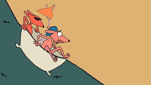
Then, not too long after, I created the mock up of the potential webcomic cover. As the storyline and conflicting personalities of the main cast are a garbled mess, so too had to be the cover page that represented them. One of the most important developmental processes of Chillweeds that I knew I wanted to emphasize through story telling was the idea that these 4 people, in the rawest of forms, were friends, when they positively shouldn't be, and yet irrevocably destined to be.
October 2019
With "Chillweeds" being the first webcomic of my career, it's been challenging to draw the same style in a repetitious manner. As the years pass me by, I hope to one day finalize the style to a way I can feel comfortable publishing a hardcover edition. Soon, I'll explore the dynamics of the remaining 2 cast members, Chad and Anne.
October 2020

To further explore the life of Chug Lumber, as he has to be my favorite from the cast, I visualized his youngest recorded form to the oldest. As Chillweeds acts as not only a coming of age story, but the aftermath of it as well, I needed to have a base idea of where he was heading in life.
October 2020

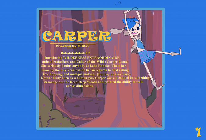
CARPER

Carper Leone is just your average inter-dimensional orphan who lives in the woods with her two best friends. She's got problems like every girl out there, whether it be forced to walk across the fabric of reality, or to finish her chores by chow-time. One thing's for certain, Life is crazy!
Adobe Photoshop
Adobe Illustrator
Summer '17


When deciding on the name for "Carper" I had to think back to the origins of the story. I knew it had to be created with the intent to showcase my love for the countryside. On a road trip to Cripplecreek, Colorado, my family and I passed a plethora of trees and flat lands, all of which where saturated with the colors of Autumn, and it was on this roadtrip I knew what I wanted to built the world around. Then, when driving side by side to a river, I felt the urge to name the show after a species of fish, one that was powerful yet unsuspecting. After deciding on the 'carp' I then based the entire look of the main character around it while implementing aspects of the wilderness as well.

Character Card: Carper Leone
Adobe Photoshop
Adobe Illustrator
Sketchbook Pro
Summer '17
"It Takes a Village"
SKETCH CONCEPTS

During a trip to Thailand, I was able to think further about the occupants of the town from which Carper hails from. Though she's iffy about her own parentage, or even where she's come from, the town stands as the only true home she has. These kooky folks all have inter connecting stories, familial bonds, and the resilience needed to overcome adversity.
Graphite and Ink
Summer '13

For awhile, I experimented with rubber hosing to see if I could give Carper cartoonier effects in her fictional world.
Graphite and Ink
Summer '14

With each new dimension Carper cuts into, she's forced to leave a piece of herself behind. With her physical body left in the true world, her spirit transports itself to a world with creatures unknown. More often than none, it's landed her into heaps of trouble, yet she can't shake the feeling ...that they're trying to say something.
To the Right, are some sketches I did early on in concept development in regards to her dynamic with her two best friends and secondary characters.
Adobe Photoshop
Adobe Illustrator
Ink
Colored Pencil
Summer '17

Facial design is something that still is being worked on, as I want to do something unique to the world, but easy to replicate.
Ink
Summer '14


In this comic strip, Carper has found that she's been made into the image of a rabbit. As she forcefully tries to change back into her human form, the panels suggests that unless she leaves the dream realm, it would be impossible.. No amount of willpower can make her leave before her time. Now the question lies wherein...why is she a rabbit? And what must she do to come back home?
Adobe Illustrator
Summer '14

A Promotional Post for Instagram
Here we see Carper having a ride down the river with her two bestest friends in the whole wide world. In order from left to right: Kelvin, Carper, Conway
Adobe Photoshop
Adobe Illustrator
Summer '17
DEHOLLOW
THE STORY OF DEHOLLOW
The mundane life of Otterick Wicker is turned upside down when a music box shows up at the base of his bedroom door. Now laden with the only key that can guide him home, he travels through a dreamland known only as DeHollow- where fantastical beats and creatures roam- along with the friends of a lifetime.


The underlying story of "DeHollow" details the struggles of a young boy with the world stacked against his shoulders. As he's grown disenchanted with the role he's been given, it then takes a magical influence to remind him of the beauty of his life. Our main protagonist, Otterick "Otter" Wicker is loosely based on the personalities of the sibling yorkies that became family in 2017.
Adobe Photoshop
Ink
Summer '17


It was the beginning of Freshman year of high school when DeHollow was created. The concept itself was pieced together bit by bit from dreams I had, struggles I faced as a teenager, and emotions I felt all while living in a turbulent world. In a way, "Otter" represented my anger I felt inside, yet fleshed out as an independent character in which many could relate to. For the entirety of school, I would walk the halls and messily scribble the passing emotions I might have felt at the time, new ideas for the world of "DeHollow" as well as blurbs and sentiments I didn't want to forget.
From the beginning, I knew that the world of DeHollow had to be a form of paradise, one that knew the protagonist better than he knew himself , primarily because it was him. All of Otter's fears, passions, memories, and emotions would take on some tangible form in the world of DeHollow, allowing him to traverse a world that couldn't have existed unless he had already lived it.
Ink
Fall '13


As for the character design of Otter, I knew I wanted him to take on an 'edgier' look, but one who also appeared unmemorable in most ways, with basic features; one who looked neither special nor particularly interesting, to highlight his struggle of feeling unimportant. Otter, who wants to make an identity for himself, has forgotten how to do so and is a shell of who he used to be at only 15 years old.
His personality stems from a multitude of places, but primarily from individuals I had gotten to know through my journey through high school. He was designed to represent all those who ever felt anger at feeling insignificant due to their age, unimportant, and disillusioned with humanity.
Ink
Fall'13

I knew I needed to create a concept of Dehollow to showcase some of the magic that Otter would have to face. This lead me to visualize the people who'd occupy the space, as well as the animals, fantastical creatures, strange entities, and spiritual beings. I had to remember that DeHollow wouldn't have been created if not for Otter's emotions and memories manifesting into tangible ideas. All the objects and humans of this world had to have a backstory directly tied to something that either happened or took place in the main protagonist's life.
Adobe Photoshop
Sketchbook Pro
Summer '17
To portray the relationship of the main trio as well as visualize more of the world, I took on a watercolor project for the senior year of high school. On 4.5 ft. x 3 ft. Bristol I first sketched some possible designs, then inked, and painted. Though I had been developing the concept of DeHollow for awhile now, new ideas for episodes and characters always change with the shifting emotions of the main character. On this project, I just wanted to capture more of the vibrancy of the world, the surrealness of time and space, as well as suggest some turmoil that Otter might face.
Adobe Photoshop
Sketchbook Pro
Summer '17


Again, as Otter takes on many conflicting emotions, I wanted to portray that chaotic mess on paper. Every day, I would add things that either would appear in my life, or I would think about that could directly translate into the life of Otter. With no real direction, I would put anything and everything I might've thought of, so that in the end I would have a jumbled collection of unique thoughts that came from me as a unique individual. Then, in my brainstorming of episodes, I would point to a part of the page blindly, and build off of potential plots, character dynamics, personalities, and relationships based upon what I would land on.
Ink
Fall '15


When creating the second main character's personality, I wanted her to take on the forgotten element of laughter in Otter's life. Jonsini, who goes by Jonsi, is a character that appears in the world of DeHollow and who was directly inspired by a stranger who appears in Otter's life. As she has such a profound impact in real life, despite it being subconscious, her role had to be significant. Her blindness can be seen as a gift in the world of DeHollow despite Otterick initially being confused as to why- and promotes the idea of strength through disability.
iNDIEGA


iNDIEGA is a passion project for teens and young adults that also rose to creation in the Fall of 2013 after a dream I had. It tells the story of tomboy "Ruddy Kilner" as she traverses through a micro managed life in the city of Indiega. Unaware of the fact the landscape levitates several thousand feet in the air, she soon finds herself plummeting from the sky due a system malfunction, only to be saved by a native of Apocalyptic Earth. What ensues then is the ultimate wrestle of control as Ruddy must learn of the story of the degenerates cast out from society while preventing the subjugation of her home.
Ink
Fall '13


Though Ruddy acts as the main character of Indiega, we soon discover at the climax of season 1's pilot, that a mute individual on the back of a colossal beast has occupied a space that has existed long before she was ever born. Two class systems clash at the fall of Indiega, and Ruddy and the stranger must learn to work with each other to save their respective homes from the hands of those who wish to destroy it.
Ink
Fall '13


A concept image was created to put into perspective the largeness of the Earth inhabitant to his beast companion, but as some time has passed since the creation of this image, and I've gone over the relationship dynamic of the creatures and apocalyptic earth, I realized logically, the creature would have to be much larger. "Cereus" which is the name of a cactus that bloom in the darkness, was chosen to be the creature's name, as the evolution of his species had to thrive underneath the darkness of a storm that has raged for several hundred years.
Sketchbook Pro
Adobe Photoshop
Fall '16
After I decided to make Cereus larger in stature, I knew I had to showcase his debut in a way that would portray his size, so I created a concept image that was then sent to a local Walmart to be put upon a blanket. Holding its right side is my father, who I love very much :)
Dyed Wool
Spring '17


The native of apocalyptic Earth wears a mask inspired by deer, which an animal I chose to represent his quick and nimble nature. In a school project, I decided to try and make it out of crude materials!
The model is me :)
Hot Glue
Paper Mache
Artists Tape
Chicken Wire
Pleather
Spring '17


This cute little creature was my attempt at bringing life to a 2D idea by making it occupy literal space. Cereus was created using wire, polymer's clay, and matte paints.
7 in. x 3.5 in. x 9.5 in.
Polymer Clay
Matte Paint
Wire
Spring '17
MANDALA ON
CRESCENT
MOON

Mandala: On Crescent Moon stemmed from a dream I had, very much like the iNDIEGA concept, and is inspired off of the art style of Studio Ghibli. That dream, detailed the efforts of a little girl on a mission to recover her uncle after he goes missing on their home of Crescent Moon.
7 in. x 3.5 in. x 9.5 in.
Polymer Clay
Matte Paint
Wire
Spring '17


The character design had come to me in said dream, so I knew instantly I wanted to base her color pallet around the richness of the color blue. Because her home occupies an obscure part of the ocean, I figured that many elements of her general appearance should be inspired by culture that take place on the ocean, as well as her home.
Adobe Photoshop
Sketchbook Pro
Spring '19


Inspired off of Hawaiian culture, I decided to create a series of 'Natural World' items that range from creatures to plants to fill the space of Mandala's world. Then, using land cut outs, I created a scene where we could see those shrubberies in relation to it's environment.
Adobe Photoshop
Sketchbook Pro
Spring '20


The image above contains various items that could have made up the cultural history of Mandala's town. Many of the designs are inspired from when I lived on Oahu for 7 years.
Adobe Photoshop
Sketchbook Pro
Spring '20

The image above contains various items that could have made up the cultural history of Mandala's town. Many of the designs are inspired from when I lived on Oahu for 7 years.
Adobe Photoshop
Sketchbook Pro
Spring '20


A rendered image of calamity upon the crescent island.
Adobe Photoshop
Sketchbook Pro
Spring '20
PRED. V. PREY


These are a series of life sketches I took from various animal studies. The assignment was to create a Predatorial Hybrid, and then his Prey using a mashup of animals that can be found in a vast array of eco-systems.
Adobe Photoshop
Spring '21
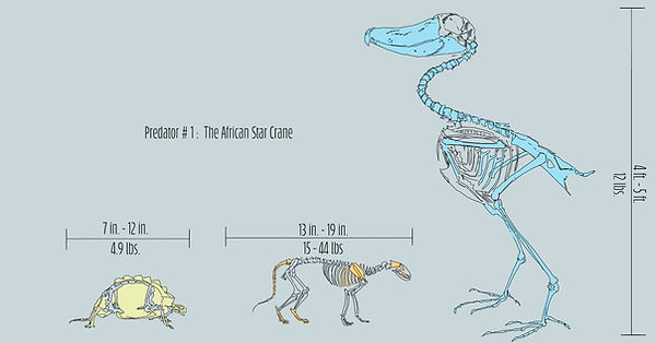

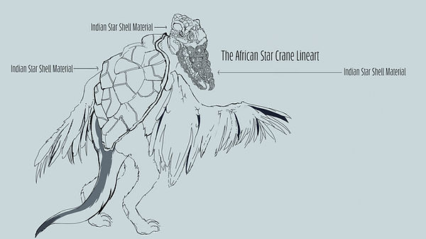

For the predator, I dubbed it "The African Star Crane" as the animals that compose it are made up of the African Civet, The Shoebill Crane, and the Indian Star Tortoise. These animals were given to me by my professor as part of our assignment, and over the course of a week, I did a series of sketches in my research in picking apart which body parts I'd want to use for its hybrid form.
In my process, I studied the defense system of each animal and picked which intrigued me the most. For the Shoebill, I knew immediately that I had to maintain it's ferocious stare.
I knew I wanted I wanted my predator to be as large as it could be as well, and for the Shoebill species, they can grow to be up to152 cm. That's approximately 4.99 ft., when you round to the tenth- the size of a small child! Imagine this guy being able to stand at a grown man's hip, while gazing at you from a distance. Absolutely terrifying.
I then decided to take the defense of the Indian Tortoise as its shell was not only aesthetically beautiful, but a near impenetrable form of protection.
Lastly I borrowed both the fur pattern and the muscular legs of the African Civet, as they're known largely for the speed of which they can run, burrow, launch themselves forward, and evade danger.
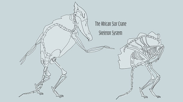
All three animals were dissected further down to their skeletal systems, where I chose where certain bones would disconnect to become fused elsewhere.
The final image's colors were inspired by the pale blue of the shoebill. The eyes were inspired from the tortoise, as well it's shell patterns being an actual part of the bill's construction- as it'll be the second hardest part of it's body. He'll need gnarly teeth with a strong jaw to pursue his prey, an animal with a prickly defense system and speed to match.
Adobe Photoshop
Spring '21

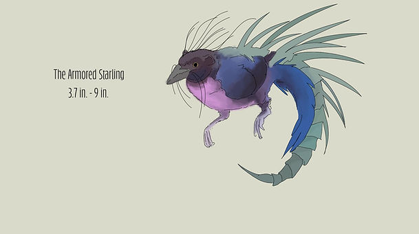
For the prey, it earned the name of "The Armored Starling" for the animals that create its genetic make-up: The Cape Starling, the Armadillo Girdled Lizard, and the Crested Porcupine. These animals I happened to choose myself, and when on the hunt for the animals that could go head to head with the African Star Crane, I knew I had to give it a defense system that the predator could easily bypass with the strength of its jaw. I took some further notes to elaborate the animals used for the hybrid that can be seen on the right.
Using the same processes for the Predator, I deconstructed each animal down to their skeletal system and chose which parts that could best be used for protection and evasion against the Star Crane.
For the girdled lizard, I found that the fact they bite their own tail for defense to be insanely unique. As they curl, their spine bends into their tail, allowing them to form a tight ring that can be used for camouflage in dessert areas. For the Cape Starling, I utilized its beak for the break down of insects and forager items, similar to the diet of said bird. Lastly, I incorporated the strength of the Crested Porcupine's neck and tail, as the animal is such a stocky, smaller creature, it relies on the muscles of it's flatter body parts to bring balance and stability.
I proceeded to meld all desired body traits until I came with the body I was happy with- that of a plump little bird. (With spikes)
For the final coloring, I took closer to the plumage of the Cape Starling, which upon first sight appears black, but in the light casts an array of wonderful colors. I then colored the spikes taken from the Crested Porcupine in a green, so that way the prey could hide itself in the grassy planes to evade detection from easier predators.
Adobe Photoshop
Spring '21


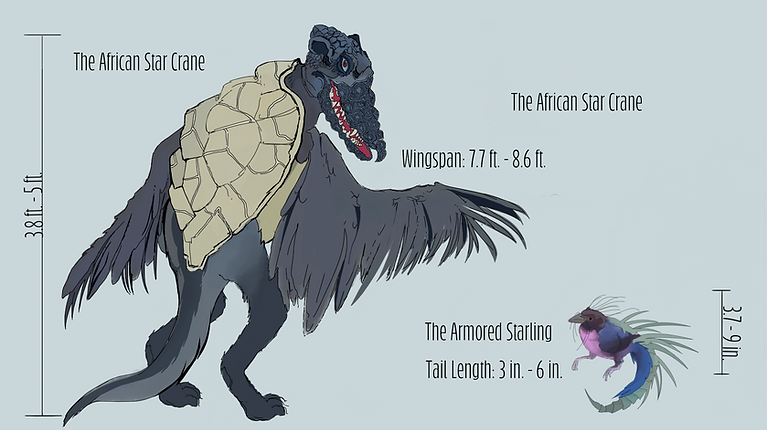
Here is the Predator and it's Prey side by side. Though the Armored Starling is considerably smaller, it has the defense system of the Girdled Lizard as well as the shooting mechanisms of the Crested Porcupine. It's rolly polly body allows it to tumble to and fro within the grassy terrain, leaving it's predator to play catch up.
Adobe Photoshop
Spring '21
BOSS AND BOX:
HYGIENE HURTS

These are concept sketches for a small animated short I developed that tells the story of Boss (Red) and Box (Pink) who are wolf friends despite being polar opposites. In this specific short story, Box, who stinks real bad, must be put through a series of unconventional methods to bathe, orchestrated by Boss.
Adobe Photoshop
Sketchbook Pro
Spring '21


Box walks over to Boss who is reading real estate.

It's because a HUGE bear is blocking the way to the water hole.
Boss walks further into the woods.

In a bathtub he has procured out of nowhere, along with items from forest, he gestures for Box to get inside.

They get scrubbed down by a set of rotating Pine Trees.

Boss stinks SO bad that he disintegrates Boss's magazine.

Boss decides to take matters in his own hands.

He snaps a branch off a tree.

Scissors snip the rope holding them back.

A rock then obscures their path and launches the both of them forward.

Box tries to explain why he stinks so bad.

Box watches the shenanigans of his friend in the distance.

He 'borrows' a bar of soap from unsuspecting neighbor, Bunny Blue.

They go flying down the hillside.

Because of Box's helmet, he has escaped unharmed. And! Smells Pine fresh. Boss on the other hand...

Here is the image of the bear redone in vector line, adaptable for animation.
Adobe Illustrator
Spring '21

A close up vector of Box as he thinks about everything that could go wrong with Boss's plan.
Adobe Illustrator
Spring '21
Sliding down the hill has never been more terrifying!
Adobe Illustrator
Spring '21
BYE BYE, BUNNY

A Doodle of a Bunny
This one doodle began the journey in creating a story of a bunny with insomnia.
Adobe Photoshop
September '21

Storyboards for "Bye Bye Bunny"
These boards tell the story of the main character being unable to sleep, and in her groggy state imagines being taken far away.
Adobe Photoshop
September '21

Character Design for "Bye Bye Bunny"
I explored some possible color pallets for the main characters.
Adobe Photoshop
September '21

First Draft Layout
Starting out, everything was very vibrant, to convey with distracting colors the idea that our character was too stimulated to sleep.
Adobe Photoshop
September '21
Draft Animation
To test out the type of animation I wanted, I used After Effects to convey simple movements with a stationary character.
Adobe Photoshop
Adobe After Effects
September '21

Second Draft for Layout
After I found out that the colors were still too much of an eyesore, even with metaphorical meaning, I toned her bedroom down but kept some pop of colors.
Adobe Photoshop
September '21
3D Highway
This was a rendered animation done by Mikel Ros of a highway I modeled and textured. A skydome is enabled to provide the illusion of a moving highway.
Maya
September '21
Finished Animatic
As I was new to the program, I had some issues with animation, such as the use of pin puppeting tools to create the effects of blinking eyes. As I explore the program more, I hope to solve my initial problems and explore more effects with new projects.
Adobe After Effects
September '21
Little Red

I wanted to dedicate a singular character in the style of Studio Ghibli as it remains as great inspiration for many of my concepts. I started with a series of sketches of the overall 'look' I wanted my female character to have. I determined her look based upon her personality. As I wanted her to be a mother, I wanted her to embody the many traits that make mothers resilient and resourceful.
Adobe Photoshop
September '21
To make her body, I used simple shapes to create curves and a general sense of roundness. Her hair is one of the more iconic parts of her figure, as I knew it had to be bouncy and voluminous.
Adobe Photoshop
September '21


To determine her face shape, I watched a series of Ghibli films to get a sense of which I might like for my character. When deliberating, I knew the face I chose would have to reflect a sort of respectable authority while also maintaining a sense of fun loving freedom.
Adobe Photoshop
September '21
After I refined her body shape further, I went ahead and did a turn around for her just in case I wanted to do an animation in the future.
Adobe Photoshop
September '21


I experimented with different facial expressions in a series of headshots.
Adobe Photoshop
September '21


For action shots, I wanted to portray her carefree nature as well as her personality.
Adobe Photoshop
September '21
Surprise! She's tiny. Like really tiny.
Adobe Photoshop
September '21
Hank PorterHouse
Presents:
The Midnight
Ride


After a riveting watch of one my favorite films known to man: "Fritz the Cat" directed by Ralph Bakshi, I had to create my own version of an adult rated cartoon concept. What ensued afterwards were one too many puns, love at first sight, and betrayals from within.
Ink
Spring '20


I had to do some facial studies to figure out what sort of style I wanted to go for "The Midnight Ride", studies that can be found on both (left) and (right) sides of the middle image. I knew I wanted I wanted the main protagonist to be angular in design, as he's crude, aggressive, and from a rougher part of town.
Ink
Toon Boom Storyboard Pro
Spring '20


The images (above) are the beginning sequences of the "The Midnight Ride" where Tomska sits at the bar engaged in drunken conversation with his boss Hank Porterhouse. To the (Right) you can read the overview of the story.
Toon Boom Storyboard Pro
Microsoft Word
Spring '20
Hank Porterhouse sits at the bar with his drunken underling, Tomska Cat.
Toon Boom Storyboard Pro
Spring '20


When creating the character design for Hank Porterhouse, I knew I wanted him to be large, stocky, and heavier in weight. He needed to be foreboding and intimidating as the prominent gang leader of Urban New Yorkie.
Ink
Toon Boom Storyboard Pro
Spring '20


To the (Right) are some design schemes of Hank Porterhouse's legendary motorbike dubbed as: "The Midnight Ride" I took multiple studies of motorbikes and crafted a vehicle that might be considered sturdy enough to once have homed the portly individual.
Ink
Toon Boom Storyboard Pro
Spring '20


China Viva, more commonly known as "Chi Chi Viva" acts as the Tertiary character to Protagonist Tomska. She is Hank Porterhouse's 'best girl' and a cheetah with a messy mop of blonde hair. Despite her lowly status within the gang, her misery is the inspiration Tomska needs to ditch the gang and New Yorkie forever.
Ink
Toon Boom Storyboard Pro
Spring '20


After being ridiculed by various members of the gang, she flees the bar.
Toon Boom Storyboard Pro
Spring '20
One day, I wish to come back to this project and explore more of the world of Urban New Yorkie as well as its characters- but for now, enjoy the most up to date animatic of:
"The Midnight Ride"
Toon Boom Storyboard Pro
Spring '20
MY FATHER
FIN


When creating the concept for this short story, I knew I wanted it to be about the pain and loss of losing one's loved one. 10 year old "Copper Nickel" must find friendship in a worn down rabbit toy he finds in the woods outside his home.
Toon Boom Storyboard Pro
Spring '20
This story largely revolves around the impact Finbad's death has on his grieving family. Though I am still in the process of finishing this story, I'm making great strides to cleaning up the storyboards.
Toon Boom Storyboard Pro
Spring '20

The most up to date version of "My Father Fin" It tells the story of a little boy trying to mend a broken rabbit he finds outside his home.
Toon Boom Storyboard Pro
Spring '20

A logo for a Scott Pilgrim project I collaborated on, made entirely with vector lines.
Adobe Illustrator
Spring '17